Last month I became aware that I was low in stock of our packaging boxes and needed to order more to fulfil orders. But instead of just contacting the manufacturer to print off another pallet, I decided to go stop and have a think.
The original box design is of a good standard, but as with any product, there were issues with it. So instead of simply fixing those issues ( and printing it in a harder cardboard to solve one issue ), I decided to go back to basics and think about the design.
I decided to start from scratch and take a fresh look at packaging. And I am glad that I did.
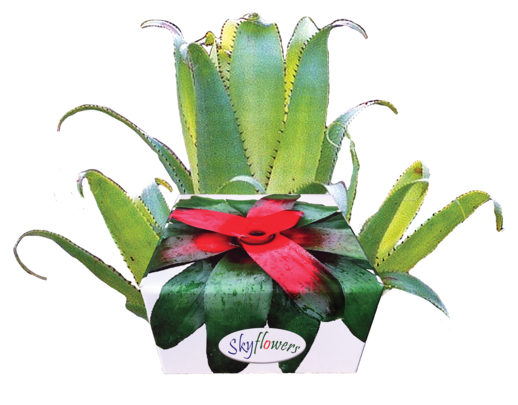
Box 1.0
I started by looking at the current box design.
I realized that the original box was designed as a mailing box, meaning its original design purpose was for packaging, stacking and shipping. While having a robust box is important, its redundant because strength is a redundant feature and a no brainer.
No, what I mean was the original box had a lid and while it was perfect for packaging up and sending to customers. How was it used at the other end?
A box for flower remedies, essential oils or allergy vials should be designed to hold bottles, firstly. Secondly to make those bottles accessible and ready-for-use. As 99% of my customers are purchasing box sets to use in a health clinic, that means a mailing box with a lid may not be the best design choice for that environment. And from feedback over the years, it wasn’t.
While I had an index sticker inside the lid so you could locate the remedy you wanted, the lid ultimately got in the way. Which is why I’m ripping the lid off and getting rid of it in the new box design!
I decided to design a display stand, rather than the boring old, box-with-a-lid. In the redesign of my packaging, I moved away from the standard box design and focused my attention on how it will actually get used in a clinic. A lid can serve as a product guide, show off some nice calligraphy and keep the dust off your bottles, but beyond that you have to open and close the thing.
Which is annoying when you have a client, there in front of you and your attention is on them and your reference books. So why not just have a display tray, with your remedies displayed beautifully and are ready to go?
That’s exactly what we’re going to do.
Box 2.0
If the first criteria was to hold bottles of 15ml remedies… and the 2nd criteria was that the box was designed to use in a clinic or at home, the 3rd criteria was aesthetics.
It had to be strong. Functional. And beautiful.
While there are a lot of well made timber boxes on the market, with calligraphy on the lids, they all follow the same formula. Open the lid and the remedies are jammed in to the smallest space possible. Being cramped, this can hamper selection and returning a bottle to the case.
That’s simply no way to display and honor the plants thy offer us remedies to our health conditions. No, the plants need to be shown off. Not jammed in a box because the maker wants to save on material cost.
In my mind, why not provide space around the remedies so that they are a joy to select. Why not design a display case that shows off those lovely upper curves on the bottle neck? A box that extends the natural contour of the bottles, creating a visually appealing display?
Fashion design meets natural therapies.
Most of the feedback I get is from practitioners excited to show off their clinic space when their box of Skyflowers arrives. This got me thinking as to design features. I realized that aesthetic appeal a beauty was a function of the box, not just an afterthought or method of attracting would-be customers.
Beauty had to be designed right in.
The result is a box that is designed for a health clinic that is appealing. In other words, it is a feature of room decor. An eye catcher. A talking point as your client enters the room. Given that it’s hard to decorate a consulting room and avoid that ‘visit to the doctor’ feel because you have anatomical charts plastering the walls, I realized that my new packaging had to be artistic and add to the beauty of the clinic room.
The box had to uplight as much as the remedies do.
Which is why I threw out both the lid and the rectangle design. And opened my mind to more rounded design as well as taller, sculptural shapes. Designs that impress as art pieces first and serve as a ‘box’, second.
I think I have created that very thing in this new line up.
Manufacturing
It’s one thing to think of an idea. It’s another to go through the entire manufacturing process. These past 2 months I have taken a crash course in product packaging, structural engineering and manufacturing processes. I’ve learned a lot.
While I could just ring up a professional service like I did with the first box design, I discovered that there are several options to manufacture the boxes in house, at home. Due to technological advances, it means that industrial machines have come down to a price point that consumers can afford.
The three technologies I looked into were robotic wood machining, 3d printing of plastic or carbon fibre and finally, laser engraving. While I plan to have a machine that does each within the next year, for now I have opted to start with 3d printing and later this year, add custom laser engraving to the services I offer.
If you haven’t seen it, 3d printing is mind blowing. Literally. The quality is outrageous.
I had seen it years ago but the machines were expensive and the results weren’t polished. Nowadays, that has all changed. They produce amazing results. And the whole production is done on my design desk.
Just yesterday I designed a display stand ( see below ) from scratch on my computer, then sent it to the printer and after a few hours had a full sized prototype in my hands. The first prototype was so good that there are only some minor settings to tweak and its done. The product is ready to publish in my shopping cart and ship out as soon as Monday.
That kind of turn around – from idea to blueprint to final product – in the space of half a day is a game changer. One thing it means is that I can custom design and manufacture new products as I think of them. Or tweak old designs and update them with new features.
Outsourcing to a factory limits you to the product your order. Manufacturing in house means I can be more agile and only outsource to a factory is I get orders that are too big to handle. Which adds extra flexibility to my business model.
New Products
WIth such speed of production and a notebook of ideas on the drawing board, I’ve spent the last week refining my creative process for manufacturing as well as shipping of product. I have a concept of the whole process so now I can easily scale it.
This creative freedom has allowed me to create a whole range of new products.
- ‘Mini’ display stands for gifts, etc.
- Professional display cases that are modular in design, each with a range of functions such as a display case for 15ml flower remedies, allergy vials and even a desk organiser designed for the clinic.
- Sculptures and 3d art that function as storage boxes for remedies or manuals.
At this stage I’m still polishing a line up of about 10 products I plan to release from next week onwards. Leading up to Christmas with some of more grander designs.
For now, as the whole process is new, I will be releasing a ‘basic’ range while I stress test my business processes to include manufacturing the display boxes. Manufacturing takes time and there are extra things to juggle, which can prove challenging when blending that into all already functioning business with orders that need to be shipped.
Blending the two should be fine. But there may be hiccups, so I will move cautiously into the market with my new range.
15ml Mini Dock
The first product to be released is the 15ml Mini Dock for displaying 5 x 15ml remedies.
This product is designed specifically to be a gift, although it would come in handy to store 5 of your most commonly issued, ‘go to’ remedies in a clinic. And use it like a bookmark, if you know what I mean.
The 15ml Mini Dock is designed to be a pint-sized companion to the other modules in the range. All of the larger designs have the same footprint of 23cm x 23cm, so you can tile them together and build your own custom side table in the clinic or on your desk at home.
You could mix and match colors and create a checker board pattern if you wanted. Which would add visual appear to your office or clinic. If you order the white fabric as seen below, you could paint them and use it as a blank canvas for your own creativity. I designed this range with the end user in mind and allowed freedom for each piece to be customized by the purchaser. The white material is textured and you could apply some amazing wood stains, for example.
The pictures below show the mini dock. This one was made from a biodegradable fabric and has the feel of fine china and the texture of cuttlefish bone. I am amazed to see it in real life and touch it and feel the shell-like texture. it’s real and not just as an idea on my computer or in my head.
The 15ml Mini Dock has ribs on the top surface to break up the hard, rectangular lines. The surface flows like water and the curved lines take away the ‘boxy feel’. The dimensions and proportions of the bottles worked out great. I’ve given then a wider space to each bottle so they look ( and feel ) less jammed in like a standard crate design box.
I am blown away by the quality. And this is just the white. There are other materials I plan to make this in, including carbon fibre, so schools can present them to students on graduation, for example. But carbon fibre comes later on. For now let’s keep things simple and ‘test the waters’.
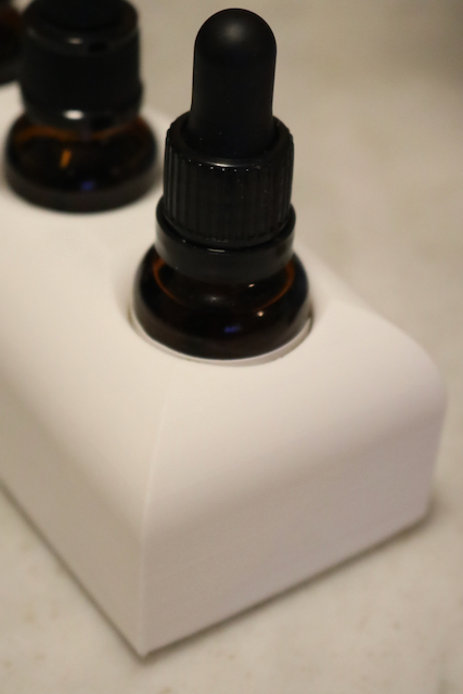
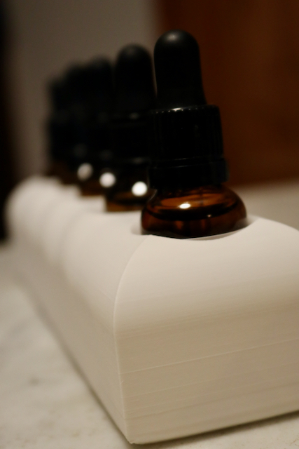
The 15ml Mini Dock is ready and will actually go live in the next day or two. It will be sold in a range of colors, fabric choices and empty or optionally as a kit with a set of 5 rescue-type, ‘ESR’ remedies.
The mini dock will come in classic colors – white and black – as they suit any decor. These look slick and professional. But if you’re a little wilder in your personality, there are also brighter colors as well as a ‘mystical purple’ that changes color on different angles and shimmers in the sunlight. You have to see it. It’s incredible.
After the mini dock comes the full size version. The 15ml Dock is a professional display case that holds 25 remedies like the mini dock, except in a 5 x 5 square grid. This is the very configuration I needed to restock and what started this whole process. Little did I realize it would lead to a dozen other designs. The full-size, 15ml Dock will also go live next week alongside the 15ml Mini Dock.
The 3rd design that will be released next week is the Allergy Testing Dock. This one is designed to hold tiny testing vials and the display case should be able to comfortably hold 100 vials in a 10×10 grid pattern. I still need to draw it up in my CAD software but my intention is to hold exactly 100 vials. This is a product that is sorely needed as practitioners commonly resort to using ammunition boxes ( yes, ammo boxes for guns ) and the colors they come in are a hideous bright blue or lime green. Comes that are designed for high-visibility on the gun range or while hunting, not for a soothing clinic space.
I have nightmares about those things!
In short, the standard gun box in the field is awful and not professional looking. So I’m changing all that with a nice, designer look you would see in Vogue magazine. The Allergy Testing Dock is on my drawing board as we speak and I am nutting out the dimensions and the details. It’s a little job for Sunday afternoon before my afternoon nap.
Release Dates
These three new products will be released early next week, before the end of July 2024. With two companion products to be released shortly after. It will depend on whether I see an upspike in mail order sales and I am too busy manufacturing the first three to release them. I’ve set a flexible schedule for products 4 & 5 in my “modular, design-your-own clinic side table” range of display stands. We shall see.
As I plan to set up an Etsy store as an outlet, I may be busy or I may not. We shall see. Current customers will be notified this week so there should be work to do. Fingers crossed and wish me luck. But even if there are no sales, it really doesn’t matter. The Skyflowers are getting a facelift and box sets will be packaged in these display stands, so its not a loss if there is no demand on day one.
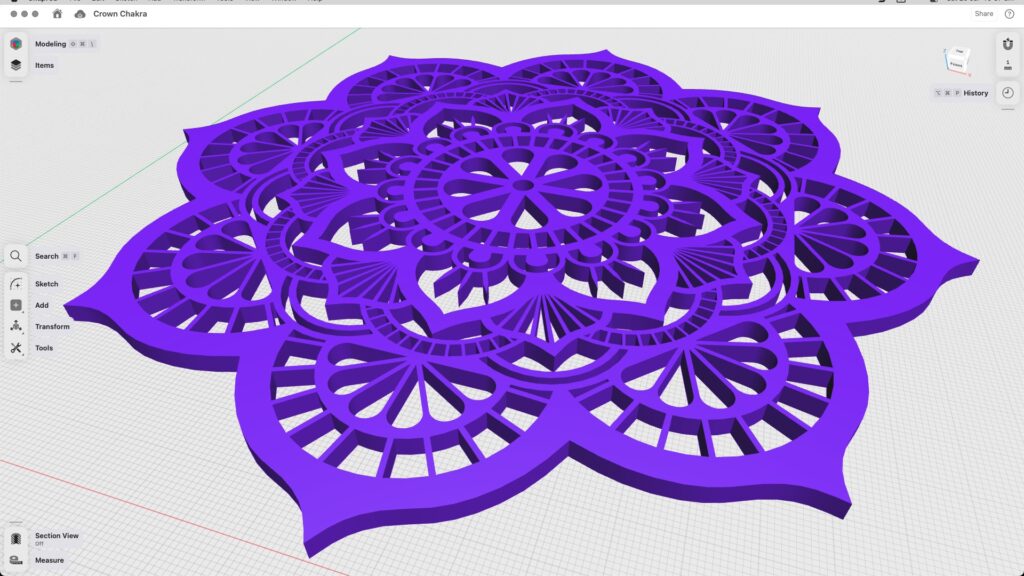
Once the “basic range” of cases are released, I will begin work on some of the more radical designs I have in mind like the indoor gardens and 3d sculptures of the chakras, like the one below. ( Think a lot taller, with bottles and crystal holders in it – this is just a sketch ) The sculptures will take awhile to design because they will double as a case for remedies or essential oils. Which is a design challenge but I’m up for it.
New Brand?
Before I end this lengthy post, I’d like to mention another item that may be ‘coming soon’. A new brand.
During the design process for all of this, I realized that what I was really doing was creating a new brand, not just a product. As I have always designed my own graphics, websites, photographed rock bands ( Midnight Oil ) and weddings ( Chloe Hayden & Dylan Rohan’s was an amazing spectacle – the photos were epic ), I thought it was time to formally package what I have always done into a new venture.
Into a new brand.
So I am in the early stages of creating a new brand and looking at the logistics. A brand that is seperate to the Skyflowers and my work in natural medicine. My new display stands will become part of a larger portfolio of work and this new venture may add a new dimension ( literally ) to my work in natural medicine.
It’s very early days and while I have the brand name picked out, I won’t be releasing details just yet. I need to do the paperwork and set things up properly before this project goes live or gets mentioned on social media. For now, “mums the word”.
Well, I guess that’s my news for now. Stay tuned for updates on the product roll out. And if you’re a previous customer who has supported my work by purchasing a set of Skyflowers, watch your inbox for a thank-you in the next week or two.
That’s all for now,
Brendan Rohan | founder of Clinical Flower Therapy
